Photoshop has three main tools for adding contrast and bringing out detail in astrophotography.
In the first part of this guide we're going to look at the Levels tool, followed by the slightly more complex Curves tool further down.
The obvious candidate, Brightness and Contrast, should be ignored as it’s a sledgehammer and we need to use a more delicate touch.
Load your image into photoshop and open the Levels tool (Image > Adjustments > Levels); this brings up a palette showing a histogram of the image.
The adjustment window is the same in full version Photoshop and cut-down Photoshop Elements, and also features in freeware program GIMP.The Levels histogram is identical to the one a DSLR displays, combining the image’s red, green and blue channels.
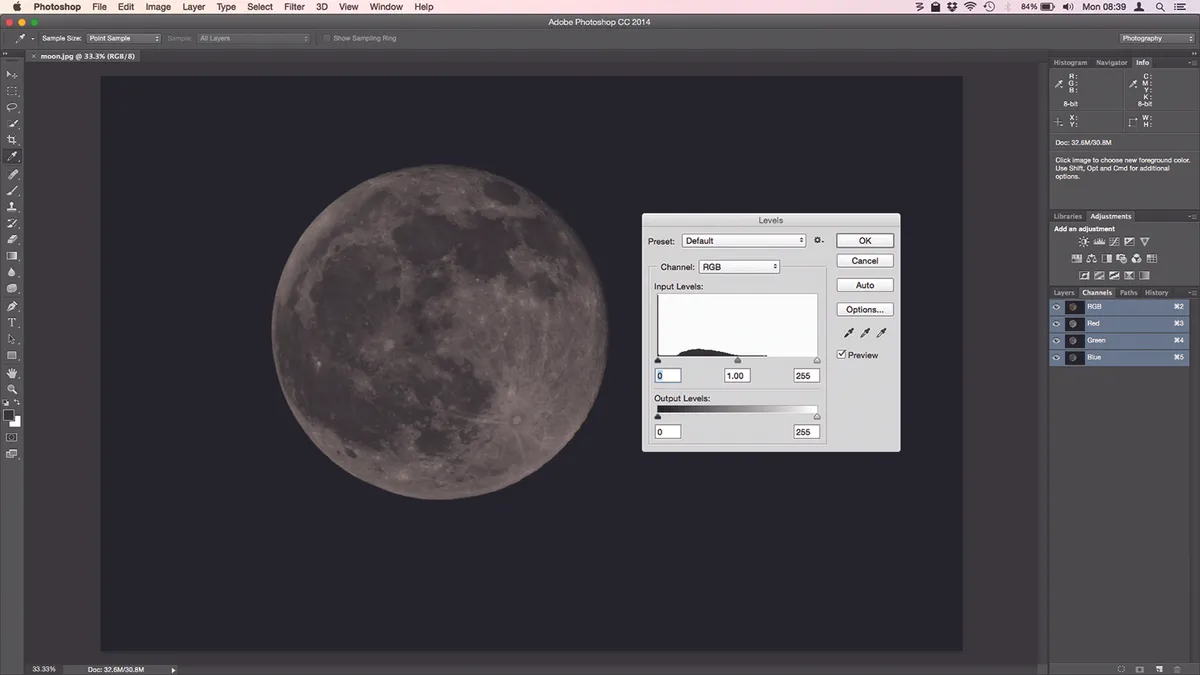
The brightness of the pixels runs from left to right, brightest at the far right, while the height of the graph shows the number of pixels at that brightness.
On an average photo you would expect a spread of tones across the histogram, with a peak in the middle, but our shot of the Moon is different.
It shows a thin high peak in the dark tones (at the extreme left) representing the background sky, plus some midtone data for the Moon itself.
As it stands now the image has no really bright highlights, so there are no peaks, and thus no image data, on the right.
Below the histogram are the three sliders used to manipulate the tones in the image.The leftmost sets the black point, where the dark tones merge to pure black.The rightmost does the same for white, the middle one the brightness of everything in between.
As we have no highlights data, we can move the right-hand slider to meet the midtone data on the histogram.
You’ll see the Moon brighten as you do this, but be careful not to push it too far as this will turn the highlights pure white, known as ‘clipping’ – you can avoid this by holding the Alt key as you move the slider: the image goes dark and clipped areas show up brightly.
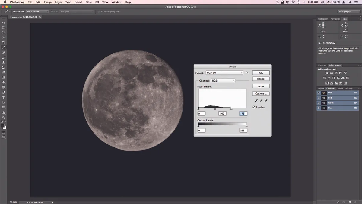
Hit OK, then open Levels again.As a result of our edits, the midtone data is spread over a wider area of the histogram and image contrast has increased.
As there is no detail in the black background, you can use the left-hand slider to darken already dark areas without losing anything.
Bring it just inside the peak on the histogram’s left and you’ll see the Moon’s seas darken.
The midtone slider can darken or lighten the image. What you’re actually doing is changing the definition of mid-grey; for our Moon photo, moving it to the right to emphasise the shadows works well.

By adjusting the image in this way we’ve made all those lovely lunar seas and craters appear more defined.
Nearly every image can benefit from adjustment with Levels; it’s a simple but powerful way to tweak your astrophotos.
How to use Photoshop Curves
At first glance, the Curves tool is an intimidating version of the Levels adjustment. They do a similar job, altering the brightness and contrast of your image. So why use Curves at all?
If you’re a Photoshop Elements user you don’t really have a choice: Curves only exists as an afterthought in that program.But in Photoshop or freeware alternative GIMP, it’s a sophisticated tool.
Open your image –we’re using the same one of the Moon as above – then bring up the Curves window (click Image > Adjustments > Curves).When it first appears, you’ll see an image histogram much like that of Levels, but with a graph superimposed over it.
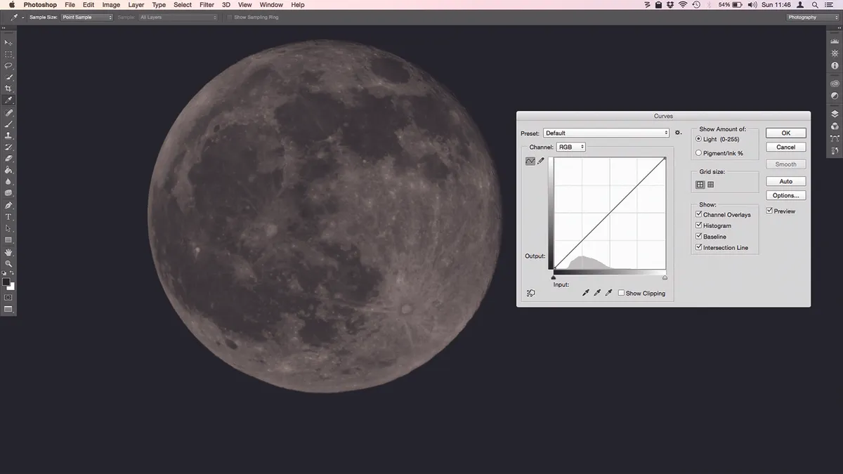
The graph will be linear: it’s up to you to add the curves by manipulating the line to adjust the tones in your image.It offers up to 16 points of adjustment, its major advantage over Levels.
The X axis of the graph represents input (the tones in the image as they are at the time) with dark at the left and light at the right.The histogram shows how many pixels in the image are at a particular brightness.
The Y axis is output (the tones as they will be after you confirm your changes). By moving the graph you alter the mapping between input and output tones, brightening or darkening specific tonal ranges in the image.
What this image of the Moon needs is additional contrast between its dark seas and brighter uplands, without clipping any light areas to pure white.
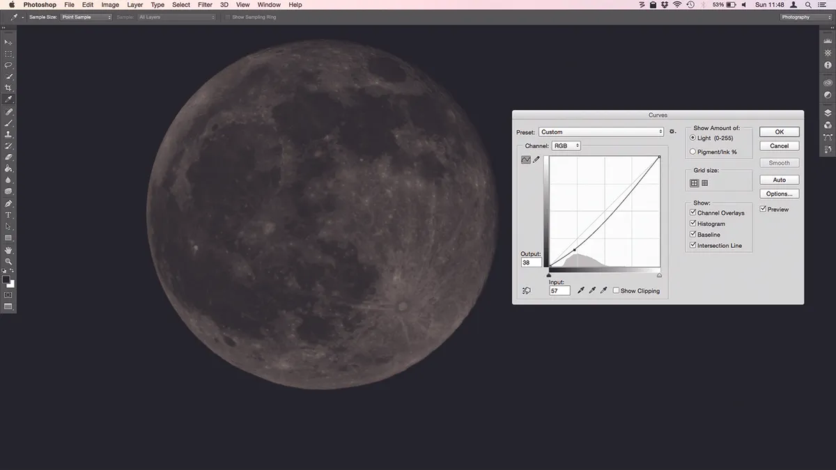
The classic way to use Curves is to form the central line into an S shape, but on our Moon picture this pumps far too much contrast in.
A shallow S with an additional point to straighten the curve in the midtones gives a better result, but we could have achieved this in Levels. Time for more points.
Starting in the bottom left of the graph, adding an adjustment point about a fifth of the way up and dragging it down with the mouse darkens the darker areas of the Moon.
Higher up the graph, we add a point near the top and drag it upward to brighten the highlights.
It’s easy to see when highlights are clipping, as the graph flattens against the top of the window; holding Alt as you work for a more dramatic representation of unwanted pure white areas.
Adding a point halfway up the graph and moving it up, then points above and below that which are dragged up and down respectively, gives us a good contrast between the different areas of the Moon, and brings out details in the image.
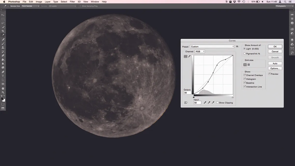
Adding Curves as an adjustment layer allows you to turn the effect on and off at will, and changing the layer’s blend mode to Luminosity allows you to alter brightness without messing up colour saturation.
There’s no reason not to experiment with these adjustments. Unless you save over your original image file you’re not going to damage anything.
Play around with Levels and Curves, and discover the combinations that make your images look great.
For more advice on imaging equipment, find out which are the best cameras for astrophotography.
This article originally appeared in the April and May 2015 issues of BBC Sky at Night Magazine. Ian Evenden is a journalist working in the fields of science, tech and photography


